Expert Interview, Neurodiversity
ADHD, autism, diversity, dyslexia, inclusion, neurodivergence, neurodiversity
With over 3000 resources, Skill Bites courses, member newsletter and exclusive Pain Points podcast, Mind Tools Membership can help you conquer your goals and look back on 2024 as a success.
In this blog, Melanie shares our experience of working on AI Conversations, an innovative new product. We’ll cover how we approached the process of crafting skilful AI-human interactions from a Content perspective, and what we learned in the process.
Business Skills, Learning and Development, Workplace Learning
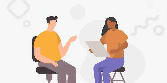
Creating work environments that support varying needs and preferences will make neurodivergent employees – and all of us – more comfortable and productive.
Expert Interview, Neurodiversity
ADHD, autism, diversity, dyslexia, inclusion, neurodivergence, neurodiversity
With over 3000 resources, Skill Bites courses, member newsletter and exclusive Pain Points podcast, Mind Tools Membership can help you conquer your goals and look…
Creating work environments that support varying needs and preferences will make neurodivergent employees – and all of us – more comfortable and productive.
Why won't they listen?! It can be exasperating when you're trying to communicate with someone, but you know that what you are saying is "going…
With over 3000 resources, Skill Bites courses, member newsletter and exclusive Pain Points podcast, Mind Tools Membership can help you conquer your goals and look back on 2024 as a success.
In this blog, Melanie shares our experience of working on AI Conversations, an innovative new product. We’ll cover how we approached the process of crafting skilful AI-human interactions from a Content perspective, and what we learned in the process.
Business Skills, Learning and Development, Workplace Learning
Creating work environments that support varying needs and preferences will make neurodivergent employees – and all of us – more comfortable and productive.
Managers have a tough job and need support to learn, grow and lead effectively. At London Borough of Camden, these pressures are combined with tight budgets and a wide ranging management population. Find out more about how Mind Tools can help.
With over 3000 resources, Skill Bites courses, member newsletter and exclusive Pain Points podcast, Mind Tools Membership can help you conquer your goals and look back on 2024 as a success.
In this blog, Melanie shares our experience of working on AI Conversations, an innovative new product. We’ll cover how we approached the process of crafting skilful AI-human interactions from a Content perspective, and what we learned in the process.
Business Skills, Learning and Development, Workplace Learning
Creating work environments that support varying needs and preferences will make neurodivergent employees – and all of us – more comfortable and productive.
Expert Interview, Neurodiversity
ADHD, autism, diversity, dyslexia, inclusion, neurodivergence, neurodiversity
Today, Mind Tools for Business has published the third and final instalment of its 2023 Annual L&D Benchmark Report.
They fly around saving the world - and offer real lessons in leadership. Discover 8 superhero lessons in being a good leader.
"It leads to what the author calls “assertive play” – not brick-on-skull assertive, but self-confident engagement, where people know they have things to contribute, and stake their claim."- Jonathan Hancock
Book Insight, Career Skills, Communication
collaboration, conflict, conflict resolution, emotional intelligence, inclusion
"A story never ends because it changes who we are, how we think, what we do. Its threads and impact continue to grow in ways we know, and don't know." - Yolandé Conradie
How can organizations help dyslexic employees? Jaye O'Farrell-Stevens shares his journey with dyslexia – and gives his tips on how to help.
“Centennial” organizations deliver benefits for communities and society as a whole, as well as for themselves.
business strategy, corporate culture, expert interview, longevity, management, organizational culture, strategic leadership, strategic thinking, strategy
Some transitions are harder to face than others. The Mind Tools coaches share their experiences of going through transitions, and their tips on how to deal with change.
We all want to be thought of as good employees, but if we really want to fulfill our career aspirations, then we need to push ourselves to be the best that we can be! After all, if we only do the minimum required of us, we probably won't get very far. So, if you've set […]
best you can be, career management, career skills, goal-setting, happiness, leadership, motivation, professional, professional development, success
Mind Tools for Business has partnered with Dallas-based learning solutions provider Tractus, to deliver Mind Tools management and leadership learning tools and resources to SMBs in the US market.
"We can also make ourselves better with “at least” statements – acknowledging to ourselves that the outcome could have been worse." - Melanie Bell
There's a lot of advice on giving praise, but how can we accept it gracefully? Mind Tools' Assistant Content Editor, Alice Gledhill, explores why accepting praise can be so difficult.
Career Skills, Communication, Stress
achievement, Communication Skills, feedback, praise, self confidence